The latest and greatest update of UAhero has arrived! We’re utterly excited to share the upgraded Recommendations screen with you, where you can evaluate the campaign performance with more insights and control all actions on one page.
Update of the Recommendations details page brings home
- A new, easy-to-follow page structure
- Graphs that visualize the data of your campaigns’ stats instantly
- New cohort metrics to provide you with more insights
- A feedback section to find out the ways to improve our recommendations
Let’s take a look at what we’ve got!
Take a peek at the brand new page structure
This update brings you the restructuring of the Recommendations details page to ensure that all your needs for maximizing campaign performance are at your disposal.

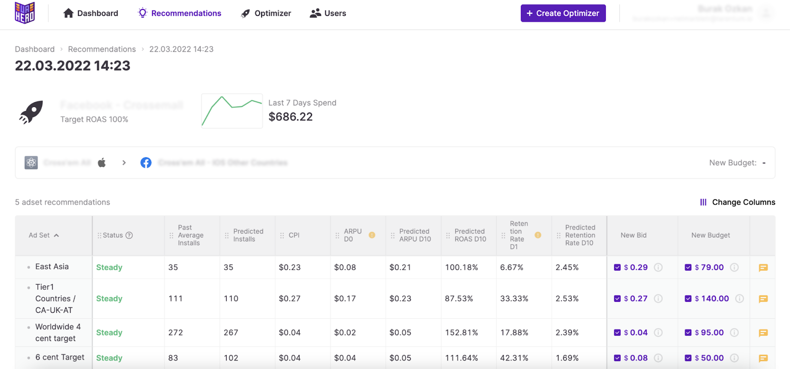
Starting from the top of the page, you can see the Optimizer and campaign details with the accentuated Optimizer icon and name if you look at the left side. Below the Optimizer name, you can find the goal of the Optimizer selected for the campaign. One significant change here is the graphs next to the Optimizer details giving the campaign's status regarding the last 7 days spend and the last 7 days CPI (for the Max Installs optimization mode). You can see at one glance if the campaign's performance is improving or if it needs fine-tuning.
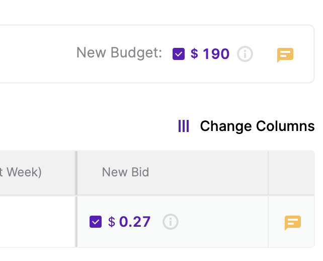
Right under the Optimizer details, you can locate the application's name and the campaign’s name for which you see the Recommendations and the budget recommendation can be found on the same line. When you look below the campaign and app information line, you’ll notice the ad unit data with the brand new metrics you can select from the Change Columns field.
Now let’s take a look into each of the features and how you can utilize them to make the most of Recommendations.
Immediately detect the underperforming campaigns with visualized data
We wanted to deliver a page with more visual elements that provide recent campaign stats to assist you in catching any underperformance issues quickly.
The graphs you can check differ according to the optimization mode selected; Max Installs or Target ROAS. You can see the Last 7 Days Spend graph in Target ROAS optimization, while in Max Installs mode, Last 7 Days Spend and Last 7 Days CPI graphs are available.
So from now on, you can check the graphs to join the dots more quickly and feed your decision-making process.
Additional metrics to evaluate the campaign performance
As you may already know, the purpose of metrics is to give you more insight into the performance of the campaigns to make a better judgment before applying any decisions. The metrics table has a bunch of improvements, including the additional metrics, renaming of existing ones, and the room to modify the table to your needs.
All the new metrics can be selected for any of the ad networks if the optimization mode you’ve selected allows. When you take a look at the metric names, a slight change in the ad unit naming can catch your attention; the naming is set as “Ad Set” for Facebook, Snapchat and TikTok, as “Ad Group” for Google and for ironSource, AppLovin and Unity it is set as “Country/Source App” to maintain the terminology associated with each ad network.
The metrics you can utilize for both Max Installs and Target ROAS optimization modes on the Recommendations details page are;
- Status
- Past Average Installs
- Predicted Installs
- CPI
- CPI (Last 3 Days)
- CPI (Last Week)
The metrics only available for the Target ROAS optimization mode are;
- ARPU D0
- ARPU D3
- ARPU D7
- ARPU D14
- Retention Rate D1
- Retention Rate D3
- Retention Rate D7
- Retention Rate D14
- Predicted ARPU DX* (dynamic)
- Predicted ROAS DX* (dynamic)
- Predicted Retention Rate DX* (dynamic)
* The X represents the number of days selected for the target window.
If you ever wonder about the meaning of any of the metrics while you’re on the Recommendation details page, you can hover over the metric to see the definition.
Keep in Mind: Cohorted metric calculations use the most recent 7 daily fully matured cohorts.
Predicted Metrics
The predicted metrics are dynamic, which means that they show the data per the target and target window you entered while creating the Optimizer in the Target ROAS mode. So if you enter 17 Days as your Target ROAS Window and 100% as your Target ROAS, the predicted metrics will be displayed as Predicted ARPU D17, Predicted ROAS D17 and Predicted Retention Rate D17, giving you the data calculated as per the values entered.
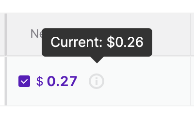
Quick Tip: Did you know that you can see the current ad unit bids and campaign budgets on UAhero’s Recommendations? To find the current values, all you need to do is to hover over the circled information icon next to each bid and budget recommendation. Compare the recommended values with the currently available ones on UAhero to save the time spent jumping between tabs!
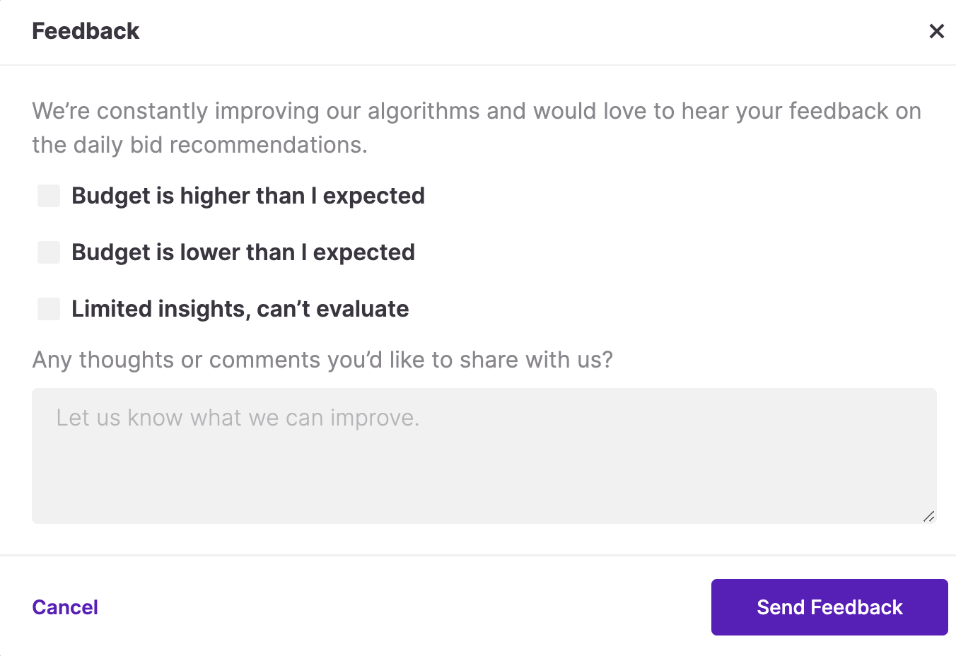
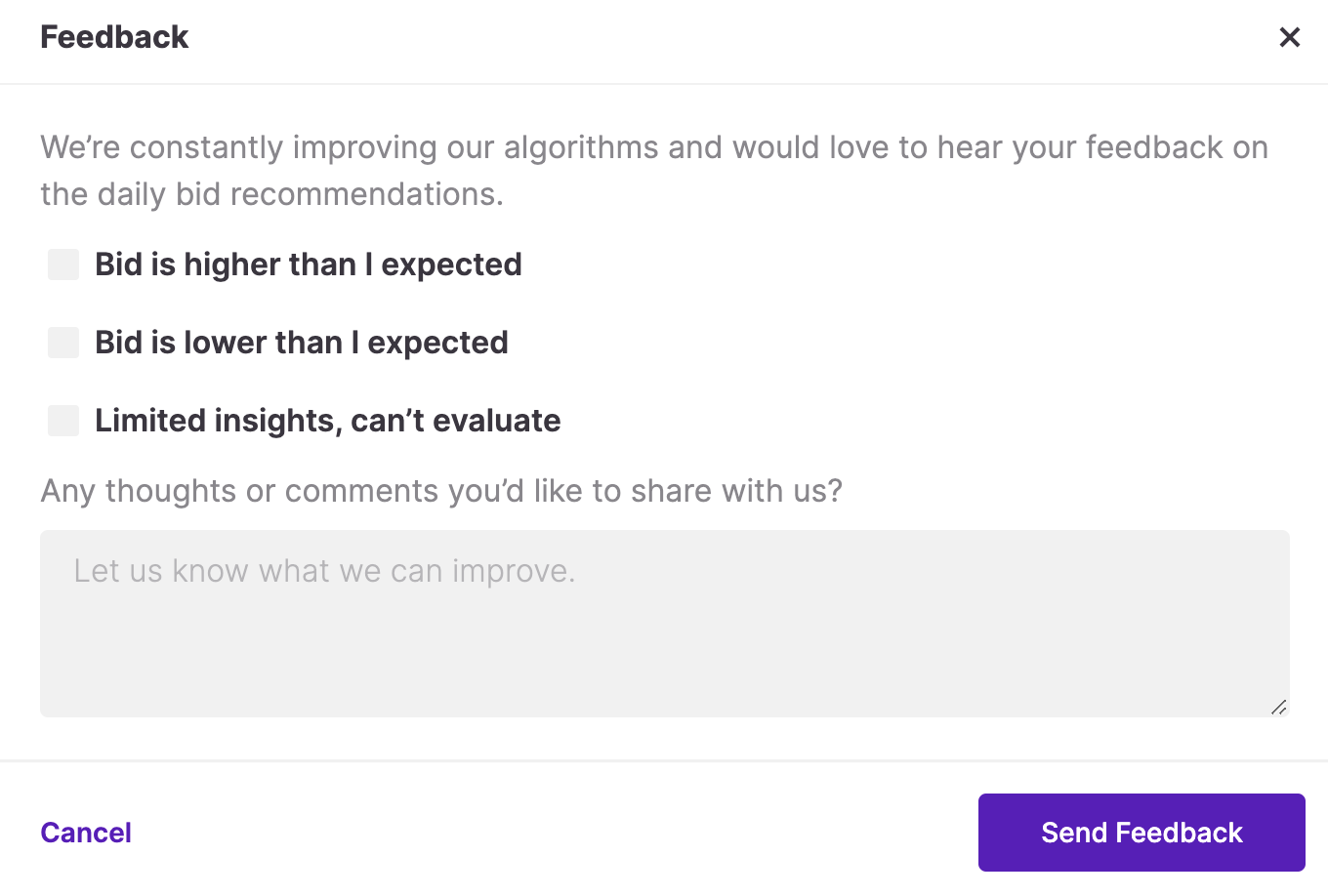
Your feedback is our compass
Your opinions and comments are our invaluable source of information when assessing if we’re achieving our goal of reducing your daily workload and boosting campaign performance. Therefore, we added little yellow feedback icons near each recommended value.
When you click on the icons, you’ll be redirected to a pop-up with checkboxes and a comment area. If you identify any issues or have any comments, please don’t hesitate to address them and we’ll do our best to understand and meet your needs.