


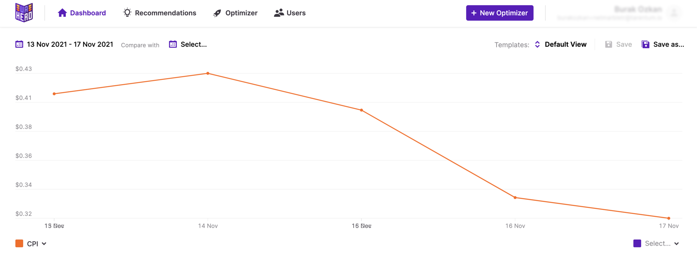
Home is the greeting page when you login to the platform. This is where you find a solution to your reporting needs. It’s a compact yet powerful dashboard where you can analyze data on different levels that go down to date, ad and ad creative level granularity. The screen is divided into two parts that work in unison. On top is the line graph and on the bottom is the tabular representation of the selected data. Managing and saving the view in these two parts to fit your needs takes only a couple of touches.
A time saver: Creating templates
At the top right-hand corner of the graph, you’ll see the “Templates” option. While analyzing metrics, you might want to look at the results in a specific way for each game, campaign, network or date. Templates help you with creating views with the adjustments you made on the platform according to your needs and are time savers when it comes to checking data at different levels on a regular basis.
Let’s say every morning the first thing you do is to check how the CPI and Install values have changed over the last 7 days for each of your games. Additionally you want to see how much budget has been spent on each of the ad networks. All you have to do is make the necessary changes on the screen and click on the “Save As” button. So the next morning you don’t have to re-arrange anything, the report “view” will be there waiting for you under the Templates. When you click on “Default View” you’ll see all your saved views to select or delete them as you see fit.

Checking the trend of metrics on the graph
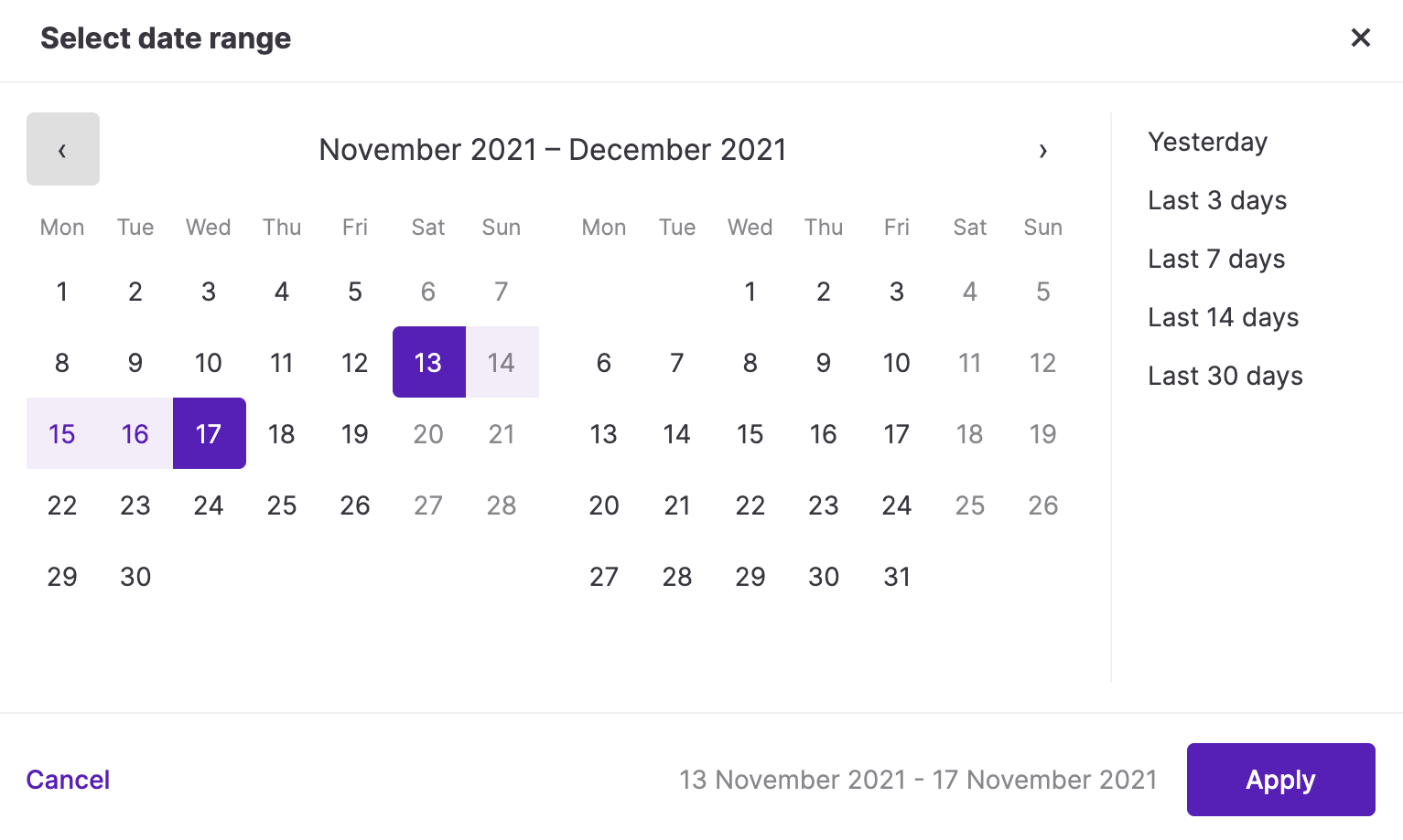
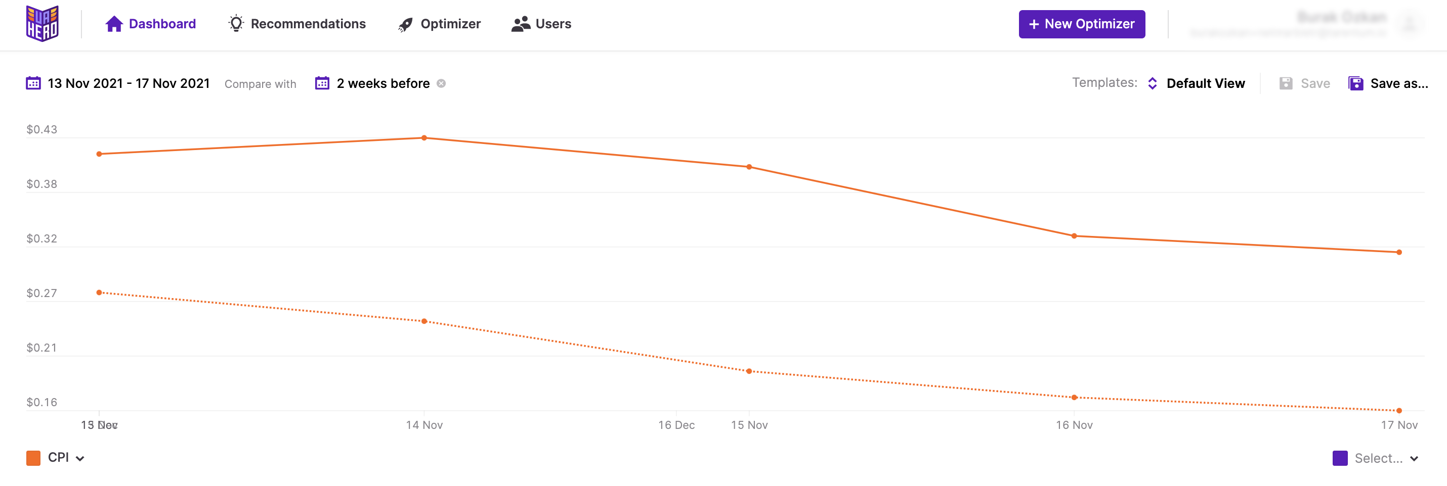
On the top left of the graph, you’ll see the date range selection area. While selecting the dates, after clicking on the area a pop-up will appear where you can select the date range by clicking on the calendar or use the predefined ranges on the right.
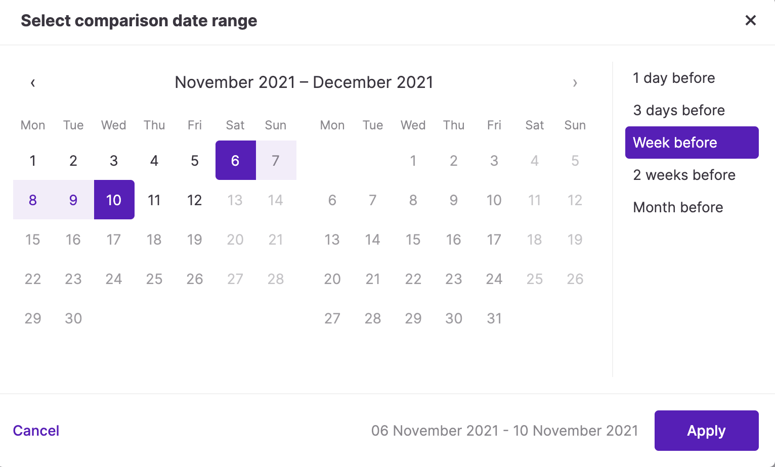
If you’d like to compare the results between two date ranges, you can use the second date selection and add the desired time period from the pop-up that appears when you click on the “Select” area. Again, you can select predefined date ranges on the right, or select the date range manually.
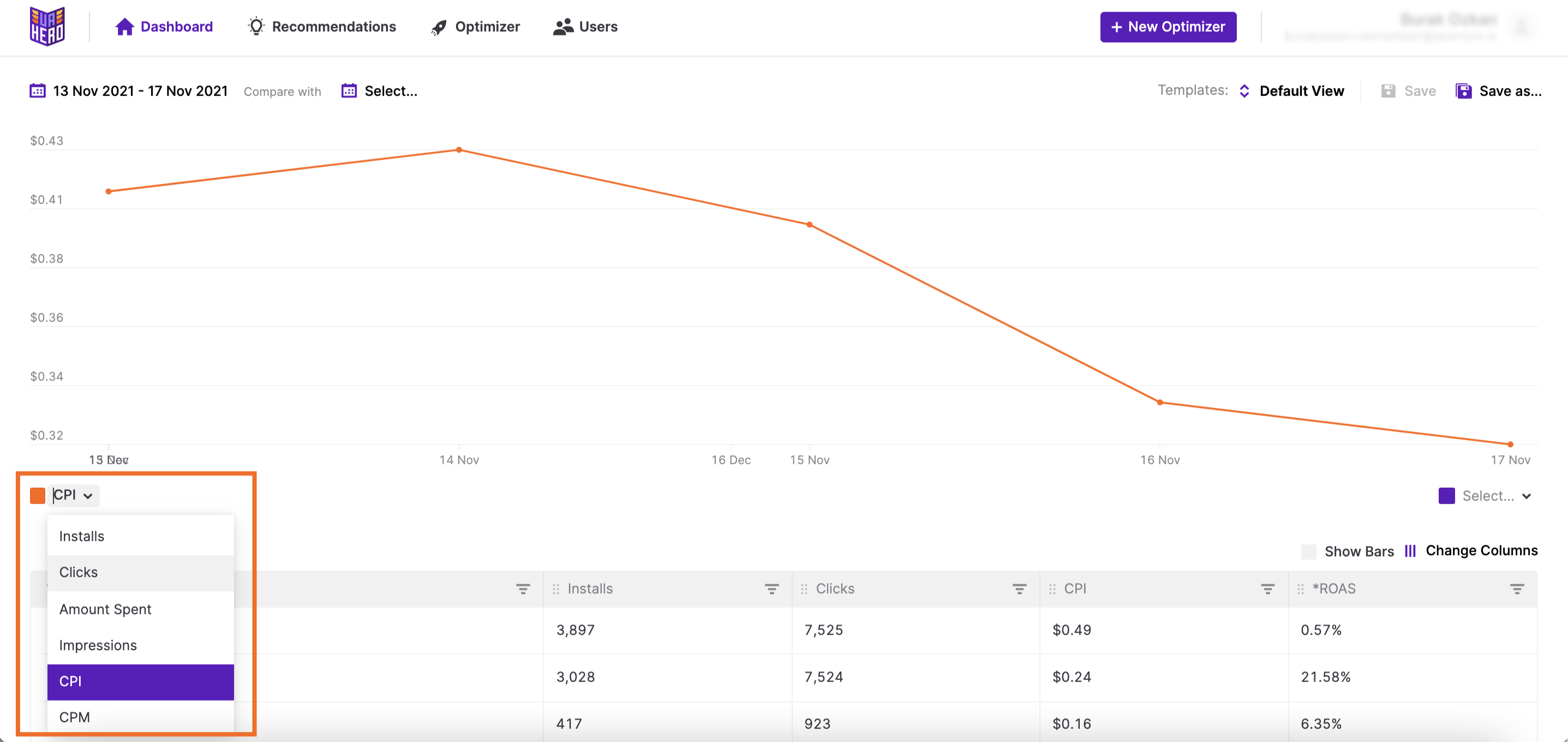
After selecting the dates, you can select the metric you’d like to see on the graph. To select the metric you need to click on the metric field at the bottom left of the graph (default value is set as “CPI”). A dropdown menu that includes all available metrics will appear.
Comparing one metric’s change between two time periods can be seen on the graph as two lines; first one is shown as a smooth line while the line for the latter time period is shown dotted.
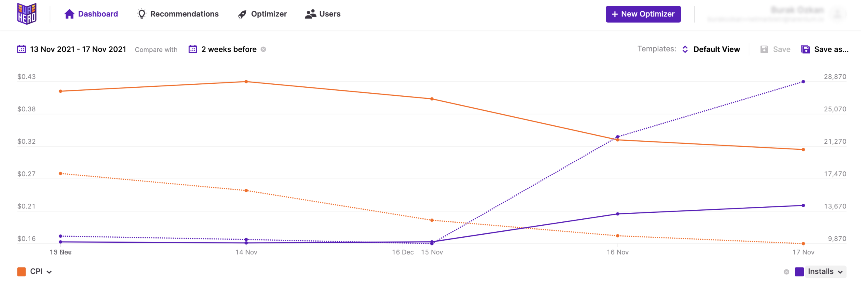
Viewing two metrics on the same graph
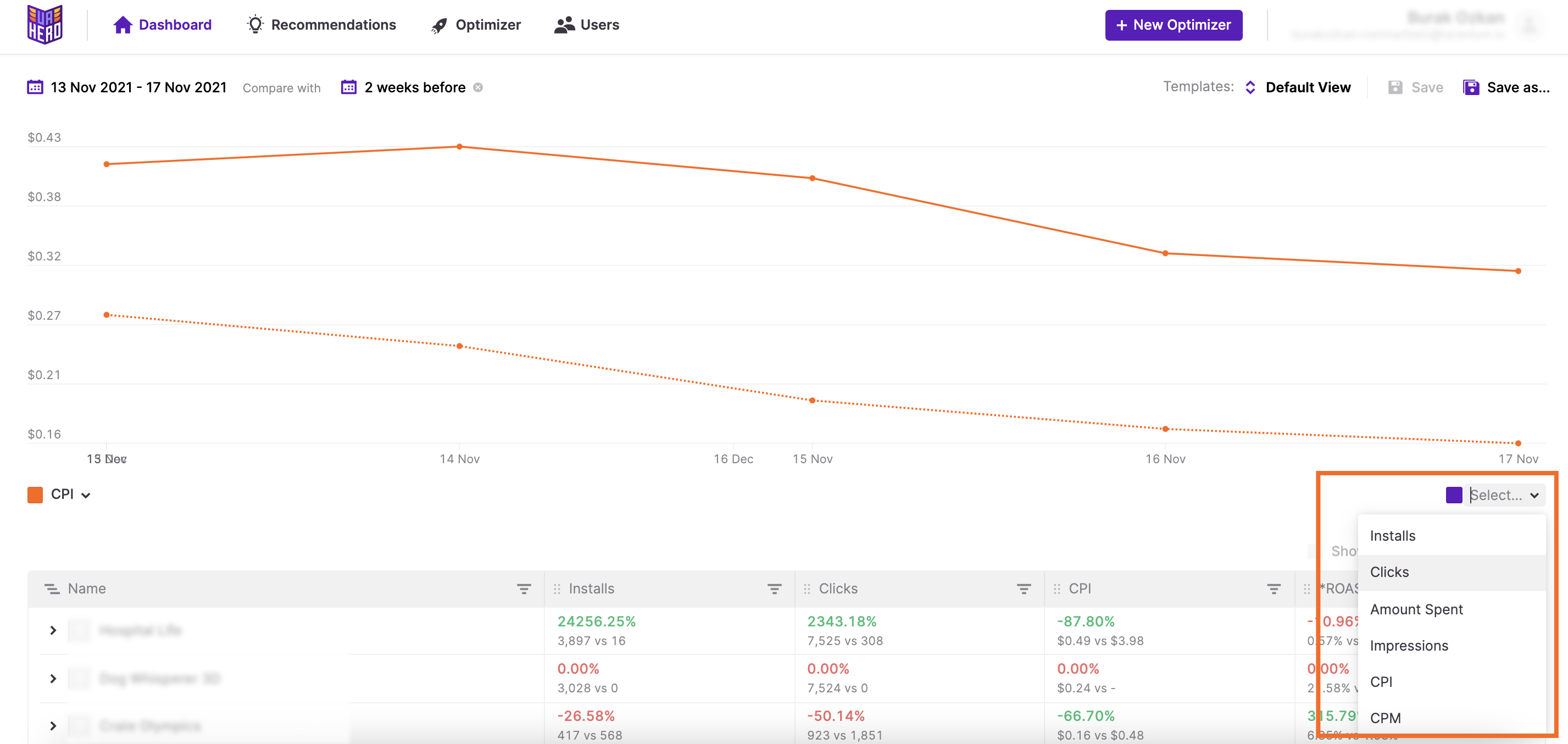
It is also possible to compare two metrics or the trend of two metrics for the time ranges selected. To add the second metric to the comparison you’ll need to click on the “Select” area at the lower right corner of the graph.
After adding the second metric to the graph, the second metric will appear as a purple line. For the metrics selected you’ll see the trend of the compared time range dotted, while the first selected time period is seen as a smooth line.
Metrics in tabular format
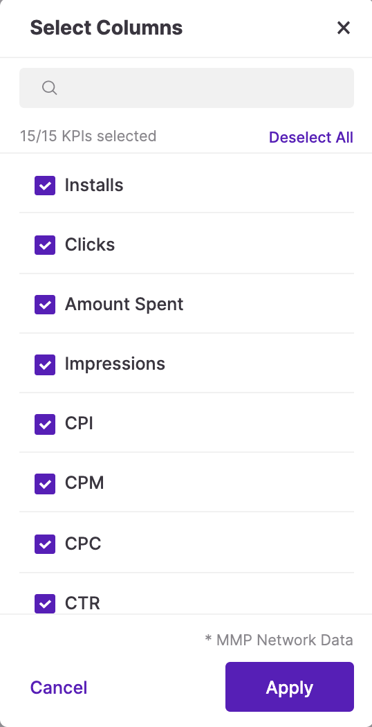
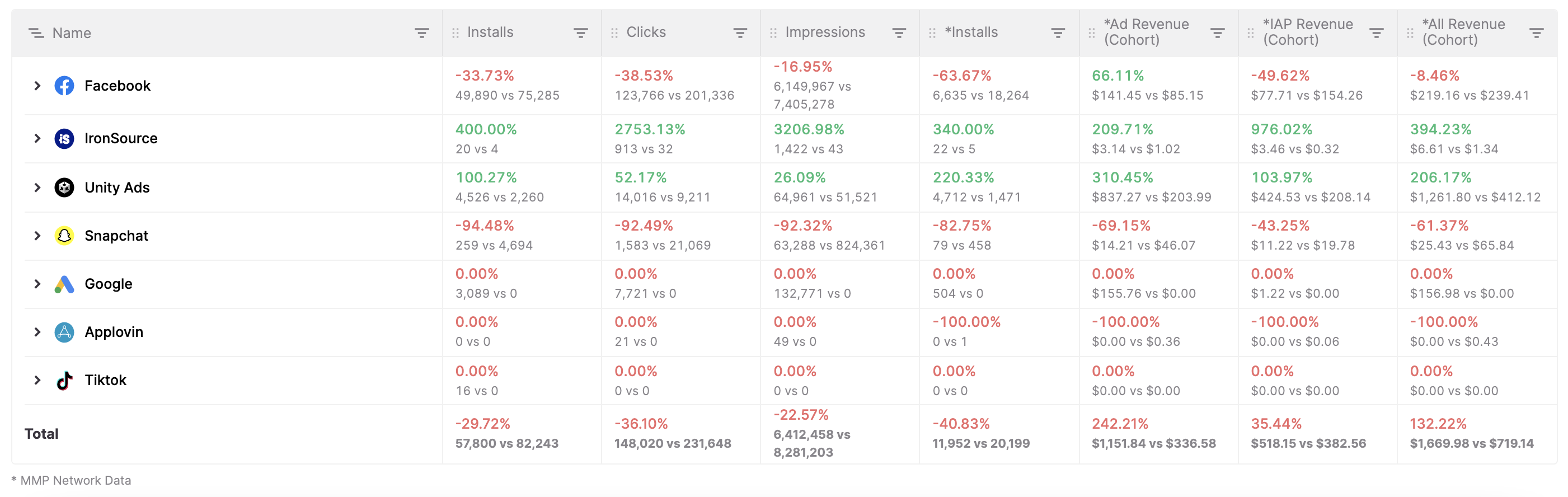
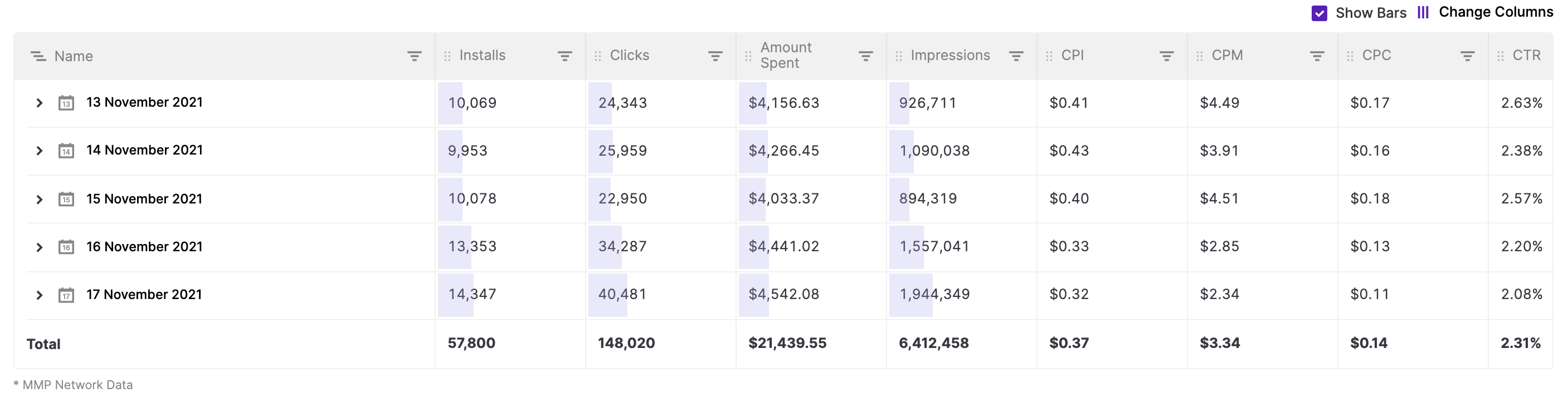
In addition to seeing the selected metrics on the graph, when you scroll down on the page, you can also look at other metrics and drill down into details in the table below. Metrics to be shown can be modified by clicking on “Change Columns”.

In the pop-up, you can search for the metrics you’d like to see by either typing their names or scrolling down. Metrics from different sources such as ad networks and mobile measurement partners (MMPs) are all captured in one place. The data from MMPs are marked with an asterisk (“*”). Seeing the data from the MMPs and ad networks side by side helps massively in sorting out the discrepancies in the data coming from different sources.
When comparing two time ranges, you can see results not only in the graph but also in the list view, which shows both the positive and negative changes for each metric selected. While the negative changes are shown in red (e.g. increase in CPI, decrease in number of installs), the positive changes are shown as green (e.g. increase in ROAS, decrease in CPI).
Filtering
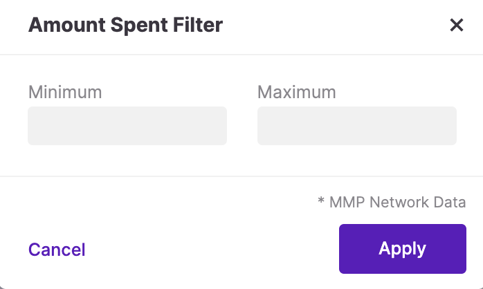
On the header of the table, you can see there are tiny funnel icons next to each metric and if you hover over the funnel, you can see that it’s a filter. If you click on the icon, a pop-up appears which enables you to enter minimum and maximum values to filter the screen even further and find the campaigns or games that fall within the criteria you’ve just set.

Changing the hierarchy
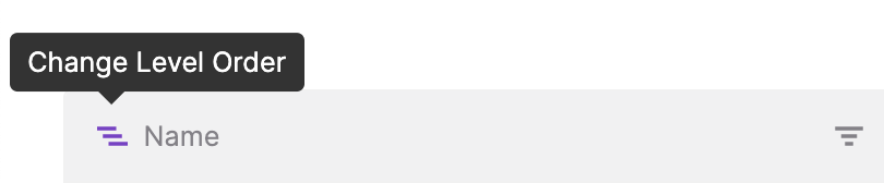
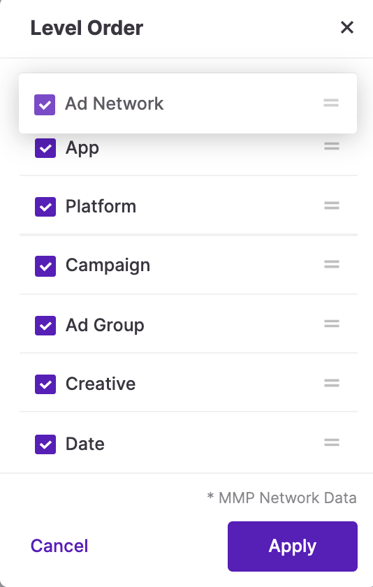
In the header row, the “Change Level Order” button can be seen next to “Name”. When you click on Change Level Order, a pop-up appears where you can arrange the level of data visible on the platform and its order. Clicking on the two lines next to the boxes and dragging them will do the trick if you’d like to change their order in the table. Clicking on the checkboxes next to each level will add or remove them. By clicking on “Apply” you’ll be able to save the changes.
Seeing creative and date level of detail
By selecting “Creative” and “Date” levels of pivot options or moving them to the higher levels in the hierarchy, it is possible to check the performance of the creatives and follow up with the daily results. This is crucial to see any positive or negative impacts of the currently active creatives on various ad networks.
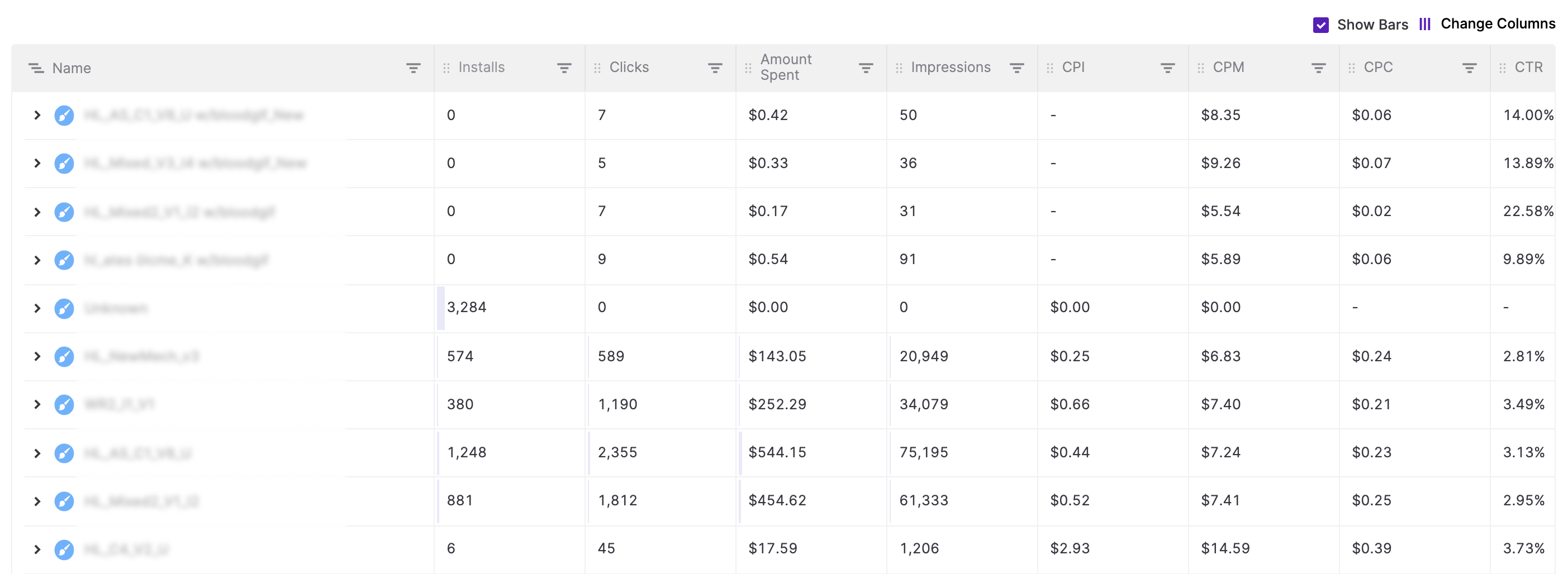
Show bars as a visual representation
After selecting the metrics and adding filters as needed, to visualize the results and understand the performance of the campaigns in a more graphic way, you can turn on the bars by clicking on the check box next to “Show Bars”. For every level you’ll see a different color. If there are better performing campaigns on the platform, this is an effective way to detect those and inspect further. Please note that this option is not available for views with time period comparison.


